As a data scientist, adding data analysis of geospatial information systems (GIS) to our skill set is a smart move in today’s data-driven world. The availability of free immense satellite and map data online, combined with the power of open source GIS tools, presents enormous opportunities for analyzing and visualizing geospatial data. With GIS, data scientists can enhance their data analytics and machine learning abilities, resulting in a more comprehensive understanding of complex problems such as climate change.
By leveraging GIS, we can monitor and track the effects of climate change on the planet by analyzing data from a wide range of sources, such as temperature sensors, satellite imagery, and ocean currents, to provide a better understanding of its impact on our environment. This information can then be used to inform decision-making processes, such as predicting sea level rise and assessing the impact on coastal cities etc.
Moreover, this also empowers common people by allowing them to answer questions about their own environment and surroundings. For example, farmers can use GIS to monitor crop health, water availability, and soil quality, while city dwellers can use it to explore the impact of urbanization on the environment. Anyone can access these tools to perform basic analysis, enabling them to become citizen scientists and contribute to the health of our planet.
In a series of posts, we will try to explore the basics of GIS, and progress towards addressing some interesting questions through the application of QGIS, Python and data visualization. Although I am also new to this area and currently learning, I invite you to join me on this excursion of discovery.
Together, we shall learn, experiment and explore the potential of GIS to transform data analytics by combining it with geospatial information.
By the end of this session, you’ll be able to do this:
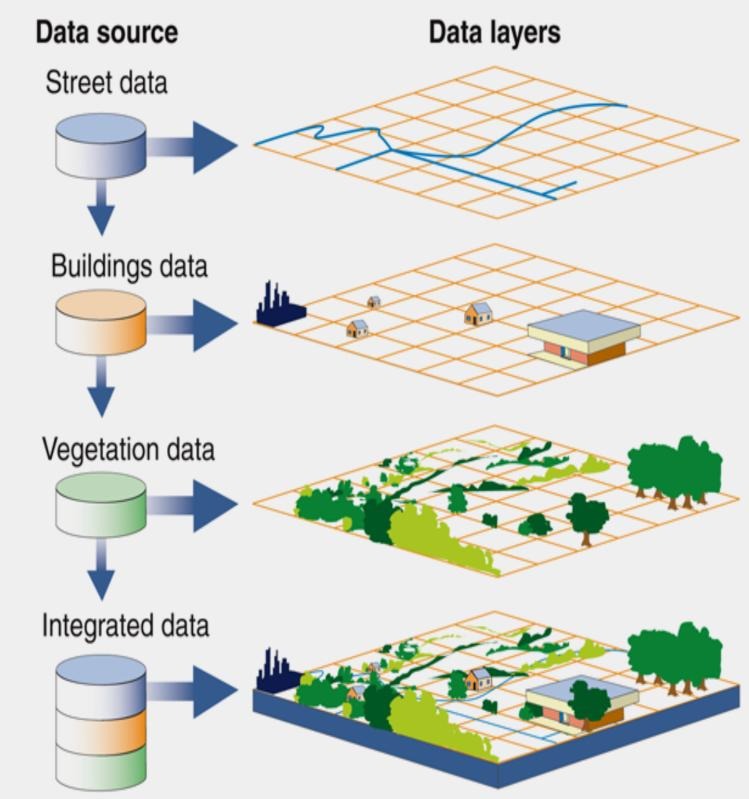
GIS, or Geographic Information System, is a tool for mapping and analyzing different types of data related to a specific location on 🌍. It allows you to visualize data on a map, such as population density, land use, or weather patterns. By combining data from various sources, we can uncover patterns, relationships, and derive insights that may not be apparent from individual datasets alone. It can be used to answer questions such as: Where are the most vulnerable areas to flooding? How has urbanization changed over time? And, where should we build a new school to ensure accessibility to the largest number of students? etc.
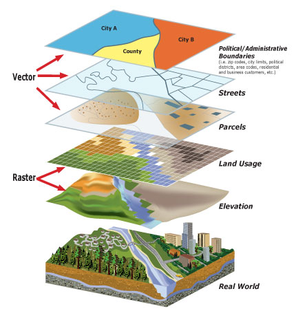
A raster layer represents continuous data throughout the map such as elevation, temperature etc. It’s made up of grid of cells and the size of these determine the resolution of the layer.
A vector layer represents discrete data such as points, lines, polygons used typically for depiction of roads, buildings etc. This data need not be present throughout the layer.
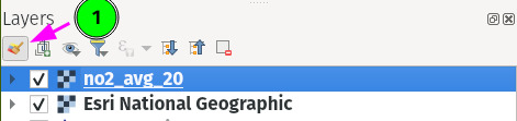
QGIS is an open source tool to explore this layered GIS. Download it from qgis.org and install it. You may be greeted with the following window. You can create & save the project by clicking Project -> Save As on the top left menu of the application.
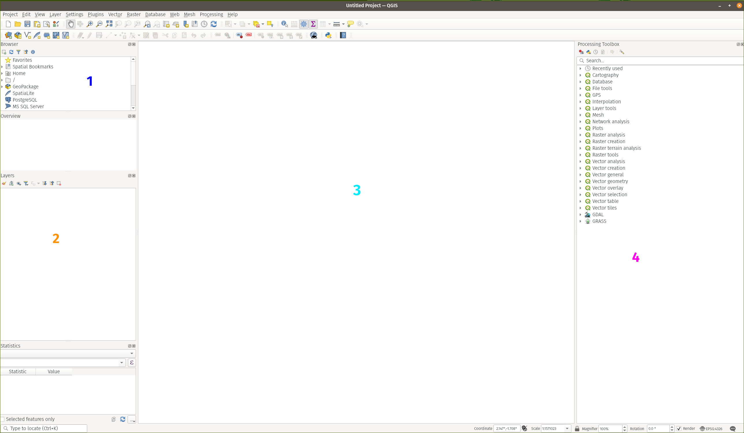
The UI is mainly divided into the following areas:
1contains the Browser where you can access your filesystem, layers, web connections etc. (discussed later as we learn).2contains the map layers that you have imported for this project/use case.3is the canvas where the layers are actually visualized.4contains all the processing algorithms that you might need to carry your analysis and also for stylizing your map data.
QGIS has much, much more things to offer but these four are good enough to start with.
The first thing we do is get some basemaps.
A Basemap is a fundamental layer that serves as a backdrop for additional data layers. It is akin to a blank slate upon which other data layers can be superimposed to create a complete picture and is an essential reference point for all other layers, allowing users to understand the spatial relationships and patterns between various data points. The basemap can be zoomed in or out to reveal different levels of detail, just like a traditional map.
For this, download the qgis_basemaps.py (courtesy of Asst. Prof. Qiusheng Wu) and open the python console like so:
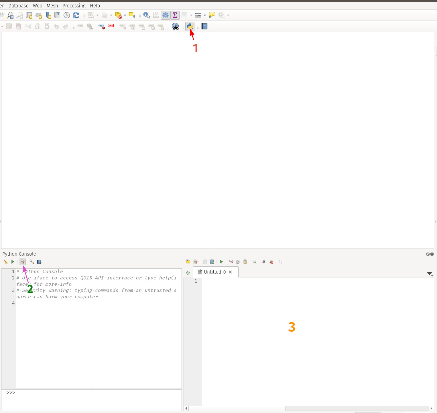
Paste the downloaded script and hit run (green ▶️). You see all basemaps loaded under XYZ Tiles in browser.
In order to view a basemap, simply drag & drop any of them into the Canvas. You will notice that the Layers widget starts getting populated. Any subsequent basemaps that you drop to the canvas will get stacked here. In general, we need one basemap layer and one or more data layers for analysis. Which basemap to choose depends on the analysis you’re carrying.
You can uncheck the layers that you don’t want or simply click on them and hit Ctrl+D to remove them.
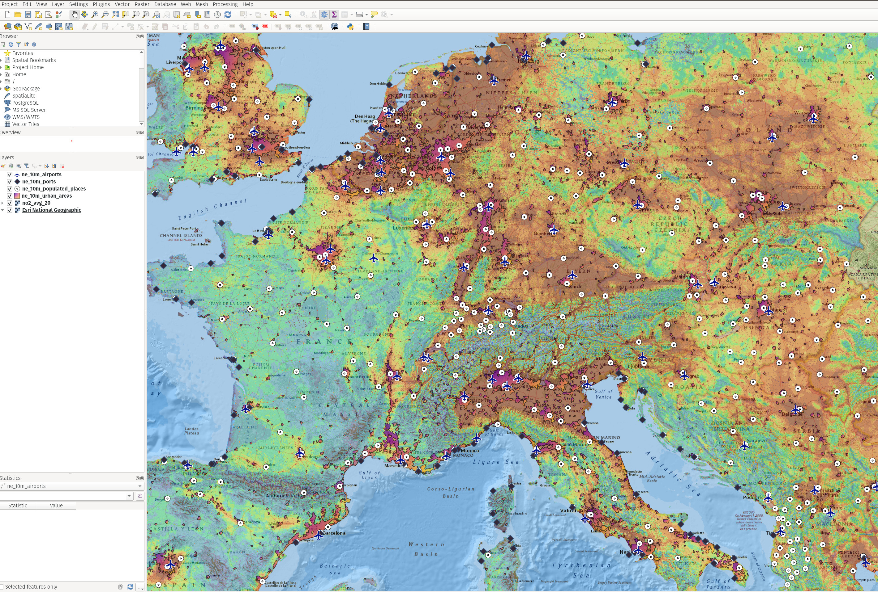
As our initial use case, let’s examine the 2020 European Air Quality dataset (head here, hit Direct Download). This dataset provides concentrations for the air pollutants \(NO_2\) at 1 km grid.
It contains a .tif file along with other metadata.
TIF or TIFF (stands for “Tagged Image File Format”), is a file format used for storing raster images, which are digital images made up of a grid of pixels or dots. They can store images with different color depths, including grayscale, RGB, and CMYK color modes, and can be compressed or uncompressed. They can also include additional metadata such as tags, keywords, and copyright information.
GeoTIFFs are similar to regular TIFF files, but with the added benefit of spatial information embedded in the file itself. This information can include the projection, coordinate system, and other metadata that is essential for accurate georeferencing. Additionally, GeoTIFF files can be used to store multiple bands of data, such as different wavelengths of light from a satellite image, which allows for more complex analysis of the data.
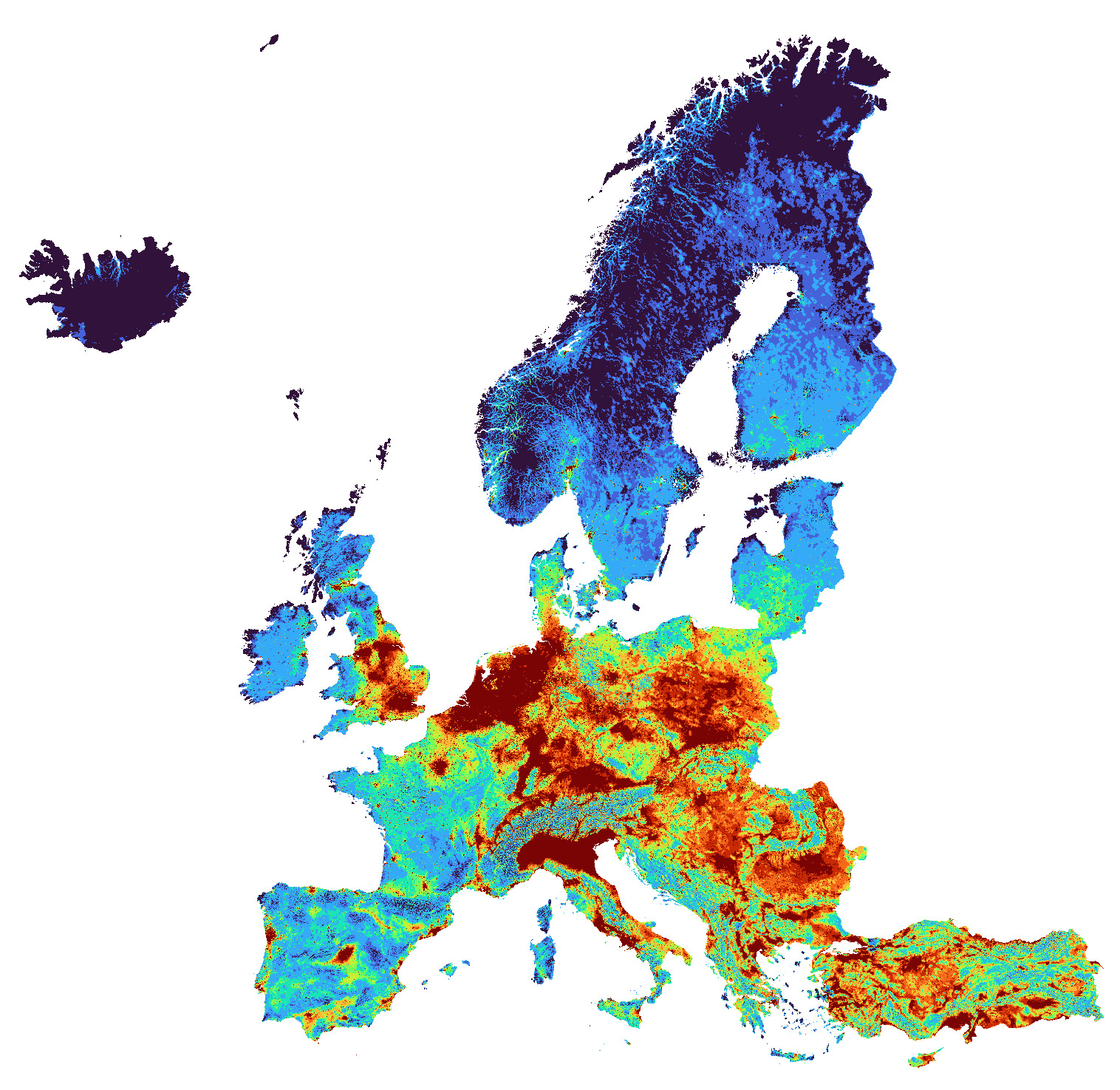
To visualize the tif file (no2_avg_20.tif), simply drag & drop to the canvas. Here’s what it looks like (after some styling). As you can see, it’s beautiful & colorful but without context. That’s where our basemap comes in, as you might have expected. You can settle on any that’s appropriate for our use case here. I liked Esri National Geographic for this as it displays the borders of the countries more clearly. And remember, basemaps always come at the bottom. So make sure you reorder them in the Layers widget accordingly.
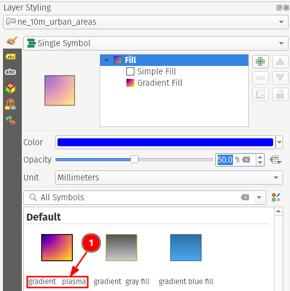
The default .tif file shows a single band grayscale image. A band is like a channel, much like RGB of a color image. But that looks dull though it has the potential to show much more visual information. We can convert those values into quantiles and visualize those instead. For that, we will now turn our attention to the styling section (shown below).
Once you click it, a new tab opens to the right in place of the processing toolbox area from the figure 3 above.
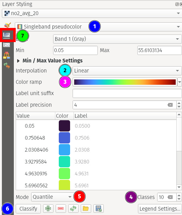
Make sure that the .tif file is selected and do the following to enhance the visual information (Fig-6(b)):
1select that to singleband pseudocolor from the dropdown menu2selectdiscreteinterpolation3select appropriate color map (spectral/viridisseems better)4choose any reasonable no. of possible classes. The more you choose, the higher the gradients of a particular color and hence not that perceivable to our naked eye beyond a certain limit.5select quantile mode6hit classify to force render the data again.7click transparency to change the opacity level to~40%so as to be able to read the underlying basemap data.
Here, we just binned the values of this grayscale image and assigned a color to each bin.
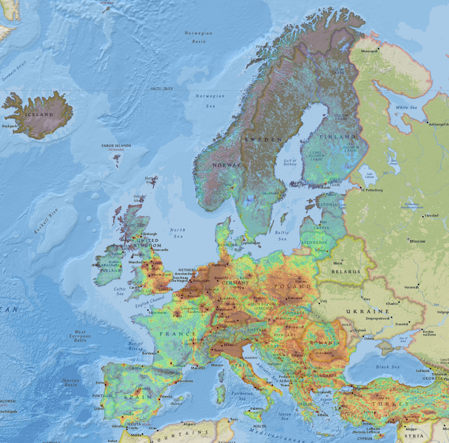
- Notice how the central europe is much more polluted than the rest.
- Western Europe is less polluted than its eastern counterpart
- As expected, all major capitals, popular cities are relatively very polluted.
In a modern industrialized world, a good portion of air pollution is caused by human settlements. To find its effects, we can check where are its majot sites. Headover here and download populated places, urban areas, airports, ports datasets and unzip them. These contain data at 1:10 (i.e., 1cm = 100km) scale.
Drag & drop the ne_10m_urban_areas shapefile layer onto canvas. This shows areas of dense human habitation.
A shapefile is a common file format used to store and exchange geospatial vector data.
You can customize the styling based on your choices and make sure it doesn’t override any of the data shown from the underlying layers. Here’re mine.
Not surprisingly, most parts of urban settlement area is under the region with worse air quality (dark red region)
Let’s now also add the populated places data layer but this time from the commandline with the help of python.
To do that, let’s open the python console from the top menu (plugins -> python console or hit Ctrl+Alt+P). Qgis already makes an instance of its interface available under the variable iface.
To add this vector layer to the canvas, simply run
# replace the filepath accordingly
shapefile_path = '/home/<user>/Downloads/ne_10m_populated_places/ne_10m_populated_places.shp'
iface.addVectorLayer(shapefile_path, 'populated_places', '')
You can notice that the layer is then added with the name populated_places. Headover to its styling to choose how those individual data points are represented.
Adding the other layers (i.e., ne_10m_ports & ne_10m_airports) similarly would give us our final result.

There’s so much information to unpack here (open in new tab for higher resolution) that I leave it as an exercise to the reader to derive their own insights.
I hope this has helped you kickstart your journey into GIS analysis and understand our world a bit better. In the next post, we will see how to handle even more types of data, perform a complex processing pipeline and more.
Bis dann 👋